
Alerts affecting people and facilities
Last updated: May 5, 2026
Introduction to Alert statistics
In the Alerts sub-module, you can view statistics on alerts and their impact on your assets.
Alert statistics is structured under three tabs:
User Alerts
Facility Alerts
All Alerts
User Alerts
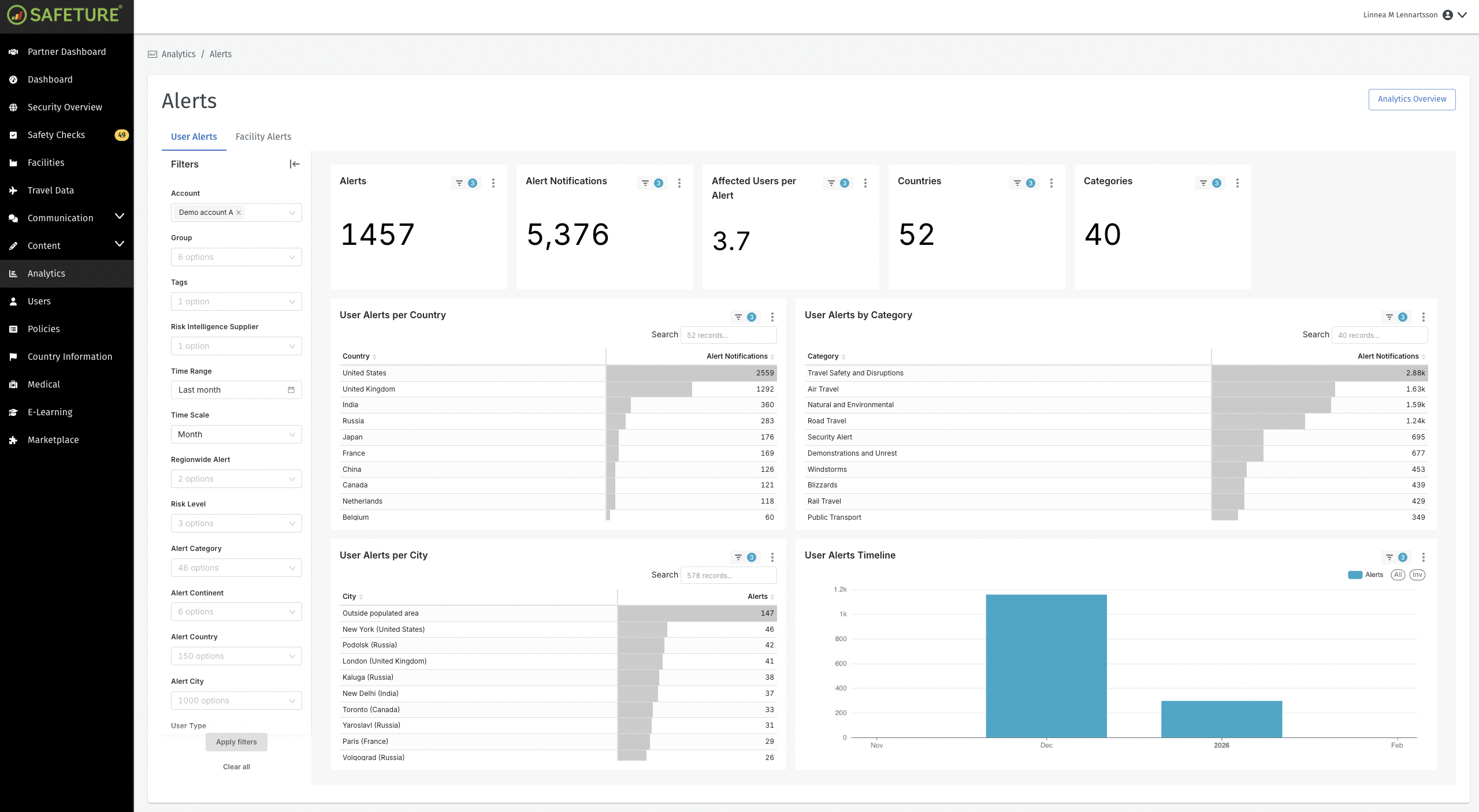
The User Alerts Overview shows alerts that have affected your personnel. Only alerts relevant to your organization are displayed here, i.e. alerts where any of your users were located within the alert's impact areas.
Filtering Options
The filtering menus in the User Alerts Overview tab allow you to customize the display of data based on the following parameters:
Account: Filters data by account
Groups: Filters data by group
Tags: Filters data by tags
Risk Intelligence Supplier: Filters data by risk intelligence supplier
Time Range: Specifies the time period you are viewing.
Time Scale: Specifies how alert data is displayed in the User Alert Timeline chart. You can choose to view data by specific time intervals like daily, weekly or monthly.
Regionwide Alert: Specifies whether to display only regionwide alerts or include all alerts.
Risk Level: Filters data based on alert risk level.
Alert Category: Filters data by alert category.
Alert Continent: Filters data by continent.
Alert Country: Filters data by country.
Alert City: Filters data by city.
User Type: Filters alert data based on users’ location or positioning method.
KPIs
In the cards above the charts, you’ll find key performance indicators. The User Alerts view displays the following KPIs:
Alerts: The total count of unique alerts affecting users within the selected time period.
Alert Notifications: The total number of alert notifications sent to users.
Affected Users per Alert: The average number of users notified per alert, determined by dividing the total number of alert notifications by the total number of alerts.
Countries: Number of countries with users that have received a unique alert.
Categories: Number of alert categories.
Charts
The User Alerts Overview tab features four distinct graphs:
User Alerts per Country: The total number of alerts affecting users in a specific country within the selected time period.
User Alerts per City: The total number of alerts affecting users in a specific city within the selected time period.
User Alerts by Category: The total number of alerts affecting users, categorized by alert category type within the selected time period.
User Alerts Timeline: This diagram visualizes your organization’s alert data on a monthly timeline, showing how alert exposure changes over time within the selected time period.
User Alerts in the Analytics Module
Facility Alerts
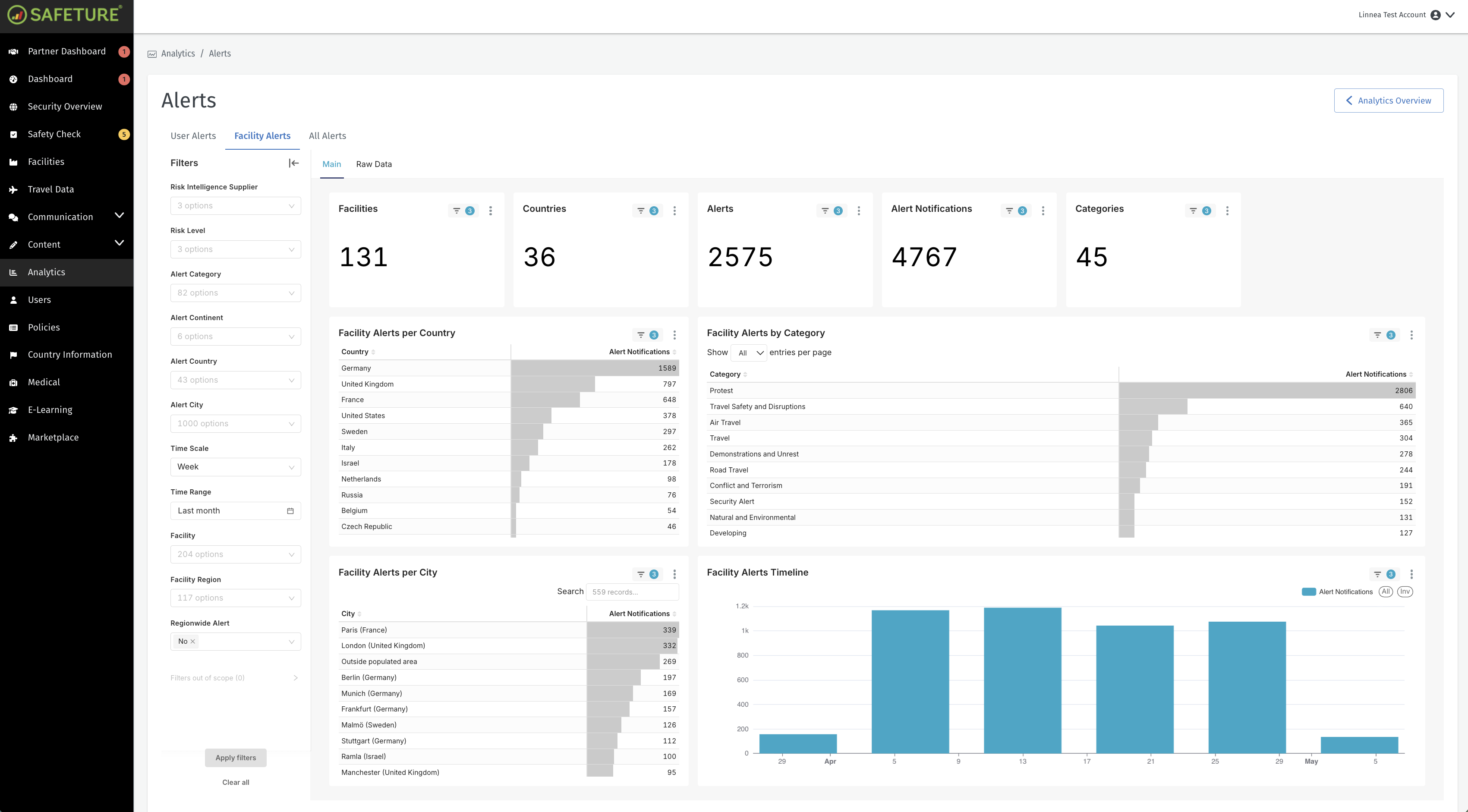
The Facility Alerts Overview focuses on alerts that have impacted your facilities.
Please note: This tab is visible even if the admin does not have access to Facilities within the platform.
Filtering Options
The filtering menus in the Facility Alerts Overview tab allow you to customize the display of data based on various parameters:
Account: Filters data by account
Tags: Filters data by tags
Risk Intelligence Supplier: Filters data by risk intelligence supplier
Risk Level: Filters data based on alert risk level.
Alert Category: Filters data by alert category.
Alert Continent: Filters data by continent.
Alert Country: Filters data by country.
Alert City: Filters data by city.
Time Scale: Specifies how alert data is displayed in the User Alert Timeline chart. You can choose to view data by specific time intervals like daily, weekly or monthly.
Time Range: Specifies the time period you are viewing.
Facility: Filters data by facility
Facility Region: Filters data by facility region
Regionwide Alert: Specifies whether to display only regionwide alerts or include all alerts.
KPIs
In the cards above the charts, you’ll find key performance indicators. The Facility Alerts Overview tab displays the following KPIs:
Facilities: The total number of facilities that have received at least one unique alert within the selected time period.
Countries: The total number of countries with affected facilities within the selected time period.
Alerts: The total number of alerts affecting facilities within the selected time period.
Alert Notifications: The total number of alert notifications to users connected to a facility within the selected time period.
Categories: The number of alert categories affecting facilities within the selected time period.
Charts
Facility Alerts per Country: The total number of alerts affecting facilities in a specific country within the selected time period.
Facility Alerts per City: The total number of alerts affecting facilities in a specific city within the selected time period.
Facility Alerts by Category: Alerts affecting facilities sorted by alert categories within the selected time period.
Facility Alerts Timeline: A diagram to visualizes alerts affecting facilties over time within the selected time period.
Facility Alerts in the Analytics Module
All Alerts
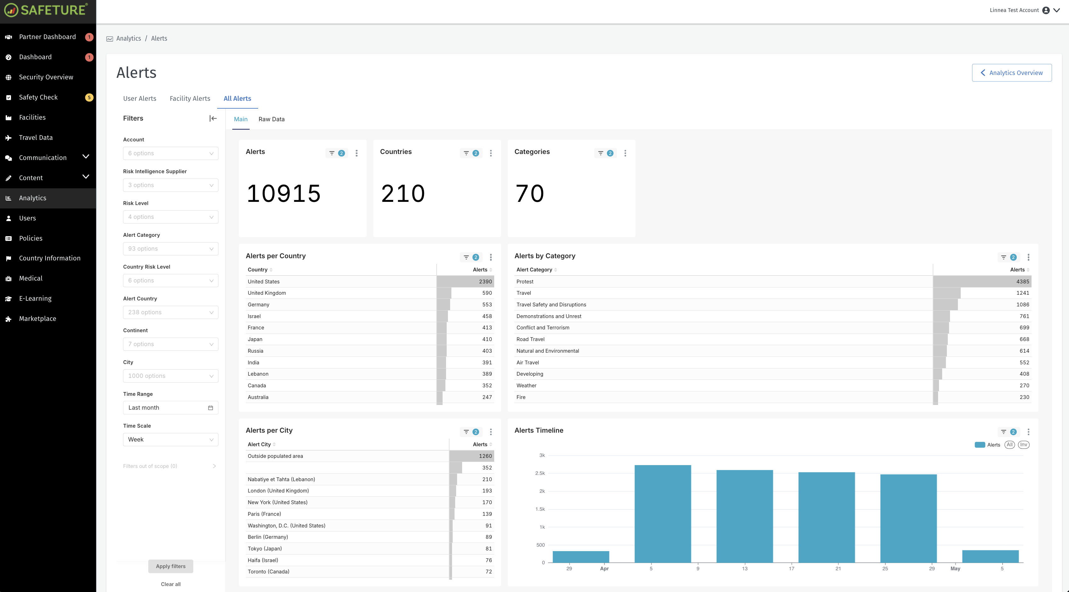
The All Alerts report provides statistics on all published alerts.
Filtering options
The filtering menus in the All Alerts Overview tab allow you to customize the display of data based on various parameters:
Account: Filters data by account
Risk Intelligence Supplier: Filters data by risk intelligence supplier
Risk Level: Filters data based on alert risk level.
Alert Category: Filters data by alert category.
Country Risk Level:
Alert Country: Filters data by country.
Alert Continent: Filters data by continent.
Alert City: Filters data by city.
Time Range: Specifies the time period you are viewing.
Time Scale: Specifies how alert data is displayed in the User Alert Timeline chart. You can choose to view data by specific time intervals like daily, weekly or monthly.
KPIs
In the cards above the charts, you’ll find key performance indicators. The All Alerts tab displays the following KPIs:
Alerts: Number of total alerts within the selected time period.
Countries: Number of countries with alerts within the selected time period.
Categories: Number of alert categories within the selected time period.
Charts
Alerts Per Country: The total number of alerts in a specific country within the selected time period.
Alerts Per City: The total number of alerts in a specific city within the selected time period.
Alerts by Category: The total number of alerts categorized by alert category within the selected time period.
Alert Timeline: A diagram to visualize alerts over time within the selected time period.
All Alerts in the Analytics Module