
Customize the display of information on the Risk map
In this guide we will have a look at how to customize the map in the security overview module.
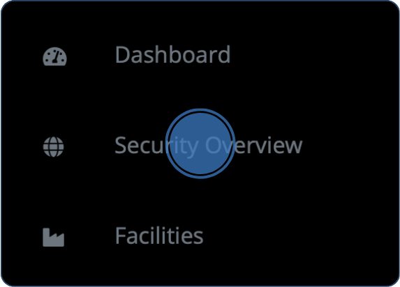
1. Navigate to the Security Overview
Click “Security Overview” in the left-hand menu in the web portal.
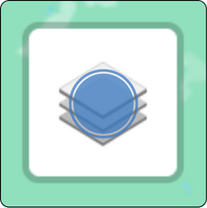
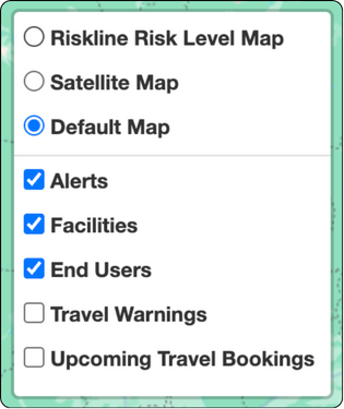
2. Choose map type and information layers
The security overview map typically shows alerts, facilities, and end-users by default. However, you have the option to customize the information displayed on the map. Simply hover over the layers icon located in the top right corner of the map, and a menu will appear. From this menu, you can select the type of map you want to display the information on and choose which information layers to show.
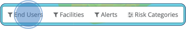
3. Filter information
When plotting elements on the map in the Security Overview, a new filtering menu will appear based on what is currently displayed on the map. In this menu, you find all filtering options.
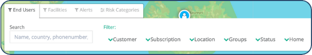
Filter users
To filter users, click on the “Users” option located in the filtering menu at the top-left corner of the screen.
In the “Users” section of the filtering menu, you can filter your personnel based on:
Customer – choose the desired account
Subscription – subscription number
Location – countries
Groups – teams of employees or managers
Status – active or inactive
Home – home or travelling users.
You can also manually add employees by searching for a name, phone number or country.
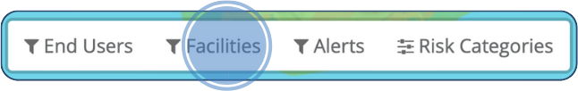
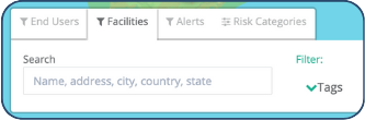
Filter Facilities
To filter facilities, click on the ”Facilities” option located in the filtering menu at the top-left corner of the screen.
If you have assigned tags to different facilities, they will appear in a list when you click on “Tags”. Select tags for the facilities you want to see on the map by filling in the checkbox.
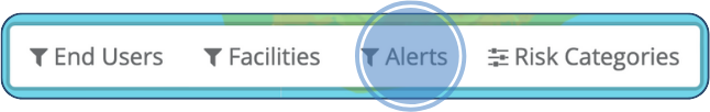
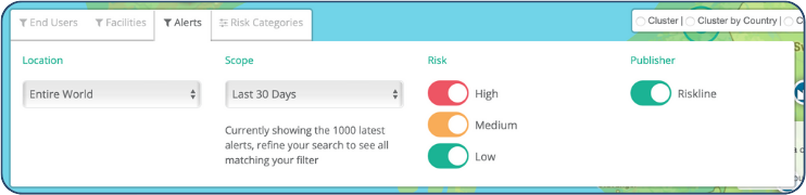
Filter Alerts
To filter alerts, click on the ”Alerts” option located in the filtering menu at the top-left corner of the screen.
In the section for alerts, you can filter based on:
Location – country
Scope – time interval
Severity – low, medium or high-risk alerts.
Publisher – either Safeture, an external content provider, or an organization.
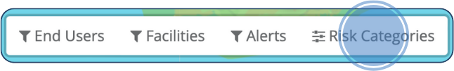
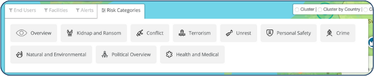
Filter Risk Categories
To filter risk categories, click on the ”Risk Categories” option located in the filtering menu at the top-left corner of the screen.
In the section for risk categories, you can click on a certain risk category of your choice, which will influence what color is showing for all countries on the risk map. This enables you to get a graphical overview of the global risk situation related to a specific risk category.
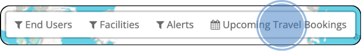
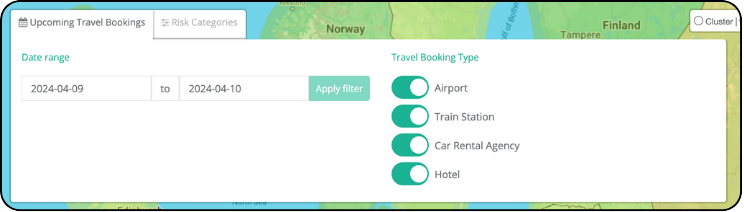
Filter Upcoming Travel Bookings
To filter upcoming travel bookings, click on the ”Upcoming Travel Bookings” option located in the filtering menu at the top-left corner of the screen.
In the section for upcoming travel bookings you can adjust date range and choose what travel booking type to display on the map.
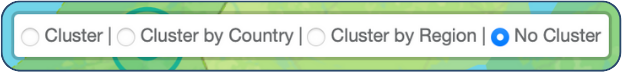
5. Cluster Settings
Click on your preferred level of clustering at the top-right corner. When zooming out on the map in the Security Overview with a cluster option enabled, the alerts will be displayed in clusters with a number representing how many alerts are joint together. The cluster is also given the color of the highest severity level out of the clustered alerts and will display a blue border presenting the outer bounding border of all incidents when hovering over the icon.
To improve your user experience, all filters and options mentioned above are stored in the browser’s local storage, which means they will remain as they were between sessions and when navigating back and forth on the Web Portal.